
Indie Dev
Screenshot Critique
")

@Companion Wulf it's available for free commercial use in the resources section of this page. I released it due to the fact I see a severe lack of options being released for others to use... I'll actually be releasing 90% of my stuff for free commercial use. Music is the only thing I wont be. I may drop a few tracks for free... who knows
Hello everyone!
I have got 2 small contributions. Two different projects I am working on :p
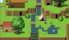
First one is called Tale of a Young Boy, wich is going to be an open world rpg, mostly story driven
All art is created by me, music made by a friend with whom I team up under the name Toxic Monkeys:
Second one is called A Dog's Secret. This is a bit of a promotion project for Toxic Monkeys. This one is also very story and quest driven.
The idea originated of my own dog who is now very old and may come to pass away soon. It is my projection of thoughts what might happen when a dog dies. All art and music created by me thus far:
Let me hear what you think of them :-)
Cheers,
samorious
[doublepost=1458071121,1458071018][/doublepost]@Bizarre Monkey I really admire the art used in your games. Played one of them too. Keep up the good work!
I have got 2 small contributions. Two different projects I am working on :p
First one is called Tale of a Young Boy, wich is going to be an open world rpg, mostly story driven
All art is created by me, music made by a friend with whom I team up under the name Toxic Monkeys:
Second one is called A Dog's Secret. This is a bit of a promotion project for Toxic Monkeys. This one is also very story and quest driven.
The idea originated of my own dog who is now very old and may come to pass away soon. It is my projection of thoughts what might happen when a dog dies. All art and music created by me thus far:
Let me hear what you think of them :-)
Cheers,
samorious
[doublepost=1458071121,1458071018][/doublepost]@Bizarre Monkey I really admire the art used in your games. Played one of them too. Keep up the good work!

that underwater swimming picture of JustSomeone123 throw me into depression again ! its really nice one !
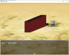
here is my silly one, random encounter in the desert :D

image upload
here is my silly one, random encounter in the desert :D
image upload
@Tuomo L I like the upgraded map, looking better now. I like how you did your grass but maybe you could add some foliage to the map? A few bushes and flowers can never hurt anyone.
@Hello! I'm curious who those nasty soldier/mercenaries are, they seem to be pretty strict on who can be in their range. The map looks pretty good for a desert map, I mean what more can really be done? If you're in the middle of nowhere it's usually pretty barren.
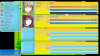
[doublepost=1459905764,1459806541][/doublepost]I been working on a menu design for my sock quest game, I got the barebones completed, I'm curious what you guys think of it. Remember it's really early stages, many things will probably change, I'm just trying to get a feel for colors and stuff. Don't mind the icon misalignment, this is a screenshot of the actual functional menu, the icons are in the image and not programmed in yet. I also never programmed in the gold window yet lol
@Hello! I'm curious who those nasty soldier/mercenaries are, they seem to be pretty strict on who can be in their range. The map looks pretty good for a desert map, I mean what more can really be done? If you're in the middle of nowhere it's usually pretty barren.
[doublepost=1459905764,1459806541][/doublepost]I been working on a menu design for my sock quest game, I got the barebones completed, I'm curious what you guys think of it. Remember it's really early stages, many things will probably change, I'm just trying to get a feel for colors and stuff. Don't mind the icon misalignment, this is a screenshot of the actual functional menu, the icons are in the image and not programmed in yet. I also never programmed in the gold window yet lol
@MistyDay Thanks for the feedback, I actually switch fonts quite often until I find just the right one, sometimes I go through 10 fonts before I feel like it's the right one, as for the colors well my goal is to have a playful, cheerful style of game so I felt bright blues and yellows would do the trick, I guess I'll find out soon enough.
[doublepost=1460073865,1459932270][/doublepost]Here is a re-vamped mockup, it's progressing, I don't think I'm quite finished yet though.
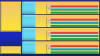
[doublepost=1460073865,1459932270][/doublepost]Here is a re-vamped mockup, it's progressing, I don't think I'm quite finished yet though.
Novaultima
Villager
- Xy$
- 0.00
In development")


- Xy$
- -2.45
Here is a little sneak peak screen shot of a new battler and new sv actor.
There are actually two battlers on this shot. The wall battlers are a WIP. Devising different ram heads. The female counterpart is pink.
Changed it up a little.
There are actually two battlers on this shot. The wall battlers are a WIP. Devising different ram heads. The female counterpart is pink.
Changed it up a little.
Last edited:
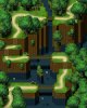
@Tuomo L i like your use of mixed tones and textures in your ground work. But in your second town the trees seem too spread out. Have you thought about grouping them closer together to create a natural boundary?
Here is my work in progress for a mountain pass. The waterfall will be animated, but i can't figure out the shadows under the bridge. They don't look quite right. Any feedback is appreciated.
edit - ok i can see what i did wrong now. The shadow from the bridge should be under the water not at water level.
- Xy$
- -2.45
@Deckard , I like how the strength of the shadows below the different bridge depends on how high the bridge is above the water . Following the shadowing of the rest of the scenery, in my opinion, the shadows for the bottom two bridges may need to lowered about 16-32 pixel spaces down. Most of the other shadows appear to be to the right and slightly down, whereas, the shadowing for the bottom two bridges, appear to be directly below or even behind the bridges, particularly the middle bridge.
@MinisterJay I never noticed your screenshots, I find it amusing and I'm curious to see the gameplay, looks interesting.
@Deckard That map is looking really good, I like your paths and especially the cliff tiles with them going underwater, all of your heights look perfect, there really is nothing on this map I don't like, good stuff. Would love to see more of your work.
@Deckard That map is looking really good, I like your paths and especially the cliff tiles with them going underwater, all of your heights look perfect, there really is nothing on this map I don't like, good stuff. Would love to see more of your work.
Terrorchen
Villager
- Xy$
- 0.00
My first map in this style. Took me forever ah! It's a bit blurry because I'm using a rather large screen resolution and uploading turned down the quality a bit.

@Terrorchen This is looking great! I love painterly styles and it really removes the grid style from the use of tiles, I definitely notice the blurriness but it still looks really good. I like the two trees you have in front of everything it really adds depth to the map. Great job I would love to see more of your work!
Terrorchen
Villager
- Xy$
- 0.00
Thank you so much!!@Terrorchen This is looking great! I love painterly styles and it really removes the grid style from the use of tiles, I definitely notice the blurriness but it still looks really good. I like the two trees you have in front of everything it really adds depth to the map. Great job I would love to see more of your work!
Anyway, here is an interior map. It's not too great because I've never drawn an interior...like...period. I uploaded it somewhere else so hopefully it didn't compress the image quality.

@MinisterJay Thanks mate, i've dropped those shadows down a bit now. You can see the finished scene in the video i posted in 'Helpful Resources' forum.
@LTN Games Thanks for the encouragement, i'll be sure to post some new stuff up soon.
@Terrorchen That art style is great, very original, i've never seen an RPG Maker game like that before.
Cheers.
@LTN Games Thanks for the encouragement, i'll be sure to post some new stuff up soon.
@Terrorchen That art style is great, very original, i've never seen an RPG Maker game like that before.
Cheers.