I do not like this new theme at all. it seems that there is no option to hide the individual panels on the left side anymore? (new posts, vip online, staff online, etc) ?
-Dislike the font
-Everything seems much smaller than before
-Difficult to describe, but I feel like everything kind of just... disappears in the sea of blackness
EDIT: Yay, the old Dark theme is still here. Thank you Xyph")
-Dislike the font
-Everything seems much smaller than before
-Difficult to describe, but I feel like everything kind of just... disappears in the sea of blackness
EDIT: Yay, the old Dark theme is still here. Thank you Xyph
Last edited:


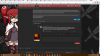
") Haha yea, it's happening to me as well, sounds like a cache type of issue with the theme. I'm loving the theme more now though, with those little fixes you already completed really makes it that much better. I'm excited to see the rest of the bugs ironed out because it will definitely be my long-term them.
Haha yea, it's happening to me as well, sounds like a cache type of issue with the theme. I'm loving the theme more now though, with those little fixes you already completed really makes it that much better. I'm excited to see the rest of the bugs ironed out because it will definitely be my long-term them.