
So, I was looking at some themes for the forum, and came across some amazing new themes. Now, keep in mind if we do choose a theme, we will use the new one as our main theme, however, we will either allow you all to choose from the old themes, or bring them back as a throw back from time to time. I haven't really decided yet. With the light theme being completely destroyed and having to re-make it completely I fear that it could happen again to the theme as well as the dark theme in the future, therefore I'm looking into other themes. Below are some themes I've found that are really good, allow some amazing customizations on the users end, and look fantastic whilst keeping the simplicity to our current theme.
Palladium:
https://brivium.com/demo/Palladium/ It's a lighter theme, but you're able to use the gear icon to the left to change the background, and a lot of stuff to match your desired taste. This way we don't need a light and dark theme, all we'd need is the one theme, and you have the ability to customize it to your liking. With this we can have some pre-defined backgrounds you can choose for, most likely all relating to RM including MV's.
Game_Zone
http://themescorp.com/demo/Game_Zone/ This theme is really nice, it has a footer, as well as if you click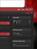 you will be able to choose a background. For this, I'd incorporate some cool backgrounds and I would have some RM pictures (Such as MV's picture) . In my opinion this one is the closest thing we have to the current theme, and is something I believe a lot of members would enjoy. However, I'd still like to ask you all what you think about this.
Now, with the RM related content, I looked into this, and we can in fact display images from them to use as simple backgrounds as it doesn't impede on them, affect them negatively, and we're using it for our site, which is a site based off of News Reporting, Teaching, and Reporting for related content with RM.
These are both really close themes to ours, so we'd initially upgrade the site to allow more user customization, and allow you all to choose what you'd like more. Now, what I need you to do is vote on which one you'd like the most. As always, you have 7 days.
Palladium:
https://brivium.com/demo/Palladium/ It's a lighter theme, but you're able to use the gear icon to the left to change the background, and a lot of stuff to match your desired taste. This way we don't need a light and dark theme, all we'd need is the one theme, and you have the ability to customize it to your liking. With this we can have some pre-defined backgrounds you can choose for, most likely all relating to RM including MV's.
Game_Zone
http://themescorp.com/demo/Game_Zone/ This theme is really nice, it has a footer, as well as if you click
you will be able to choose a background. For this, I'd incorporate some cool backgrounds and I would have some RM pictures (Such as MV's picture) . In my opinion this one is the closest thing we have to the current theme, and is something I believe a lot of members would enjoy. However, I'd still like to ask you all what you think about this.Now, with the RM related content, I looked into this, and we can in fact display images from them to use as simple backgrounds as it doesn't impede on them, affect them negatively, and we're using it for our site, which is a site based off of News Reporting, Teaching, and Reporting for related content with RM.
These are both really close themes to ours, so we'd initially upgrade the site to allow more user customization, and allow you all to choose what you'd like more. Now, what I need you to do is vote on which one you'd like the most. As always, you have 7 days.
") Idk which to vote yet but that's awesome! One thing worrying me is the amount of work you have to put in updating the website for every theme generally ? But still I love to see new themes
Idk which to vote yet but that's awesome! One thing worrying me is the amount of work you have to put in updating the website for every theme generally ? But still I love to see new themes")
")
")
")
")