
Indie Dev

Looking good, modern maps are one of the tougher styles to accomplish and you have done a pretty good job. I'd recommend adding a bit more detail to everything, maybe more trees, but definitely phone booth's bus stops, and obviously some NPC's.
If you're looking for a more futuristic style to your current city the most I could suggest is using a layers plugin to add fog, sunrays, or futuristic lighting. My first recommendation was to use a different tileset which is designed for future cities but sometimes you have to work with what you have. As I mentioned, though, cities are a tough job and you have done a good job, just remember you can slowly change your map around as your skills progress with mapping.
If you're looking for a more futuristic style to your current city the most I could suggest is using a layers plugin to add fog, sunrays, or futuristic lighting. My first recommendation was to use a different tileset which is designed for future cities but sometimes you have to work with what you have. As I mentioned, though, cities are a tough job and you have done a good job, just remember you can slowly change your map around as your skills progress with mapping.
Wiskersthefif
Villager
- Xy$
- 0.00
If you are going for that kind of grim, futuristic look...I would suggest maybe some trash scattered around, maybe some vagrants peppered in, definitely more cars and buses, and as many npc characters as possible; make it feel cramped and uncomfortable. I would also suggest making it not so bright. Also, no plants would help give it that kind of "progress over nature" vibe, depending on if this is a more wealthy part of the city, because I would think that a wealthy part of the city would still have plants.
Thanks guys I appreciate the input it helps a lot and I kind of have a better idea on how I want to go about the style. You both gave some great ideas, I'll post the evolution of the map on this thread to get some more, and hopefully, as helpful advice.
Thank you very much!
Thank you very much!
I made this map about a week ago for a contest I am participating in, I figured I'd show it to you for some inspiration and ideas of how things look good when cluttered and compacted.
First screen is the city map without events( Thanks to Orange Maptshot plugin)

This is what it looks like in-game with all the events and of course a lighting plugin. You can't see the whole map but ou get an idea of how filling in the empty space really brings it alive.

Hope this helps somewhat, it's always good to look at how others map when making your own, you learn new techniques just by looking and the inspiration is always a wonderful bonus.
First screen is the city map without events( Thanks to Orange Maptshot plugin)
This is what it looks like in-game with all the events and of course a lighting plugin. You can't see the whole map but ou get an idea of how filling in the empty space really brings it alive.
Hope this helps somewhat, it's always good to look at how others map when making your own, you learn new techniques just by looking and the inspiration is always a wonderful bonus.
Awesome! this maps looks amazing! is this parallaxed?
In my opinion, there are things that can be improved from the lighting standpoint, instead of making the whole city dim with a few light, it will look better if the nights looks darker instead of dimmer, and the lighting can be improved, using a more yellowish texture instead of white.
There is a tutorial on fog, lighting and parallax mapping tutorial on a youtube channel called Echo607 try to look at her maps and see what she does better in some parts of the mapping aspect.
In the end however, the map still looks great! keep up the good work ^.^
Last edited:
Wiskersthefif
Villager
- Xy$
- 0.00
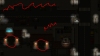
I noticed some things here and couldn't help but offer some thoughts (not meaning to be nosy, I just like it when people critique writing that I do, so just thought I would). I had a buddy who was a slumlord in Chicago, not really, but he owned buildings in a pretty rough part of town. I always remember him telling me about how he always made it a point to keep the doors of his buildings lit at night, to scare away thieves, drug dealers, etc. So, I would suggest possibly extending the light from those lamps next to those doors to cover the doors a bit.I made this map about a week ago for a contest I am participating in, I figured I'd show it to you for some inspiration and ideas of how things look good when cluttered and compacted.
First screen is the city map without events( Thanks to Orange Maptshot plugin)
View attachment 4081
This is what it looks like in-game with all the events and of course a lighting plugin. You can't see the whole map but ou get an idea of how filling in the empty space really brings it alive.
View attachment 4082
Hope this helps somewhat, it's always good to look at how others map when making your own, you learn new techniques just by looking and the inspiration is always a wonderful bonus.
And I would suggest extending the police line to include the chalk outline of the dead person.
Also, the wavy lines mean that it looks a little too dark, meaning that you might benefit from adding another streetlight; large cities like that actually have some kind of rule about how far apart street lights are supposed to be, but in the case of top-down video games like this, I would imagine that it is more of a case of symmetry. Like, between the green and yellow cars might be a good place on the top wavy line.
Hey, thanks for the critique, I am aware of a few issues with the map unfortunately this project is due in about an hour and it was only a 2 week contest so I rushed quite a few things, the lighting I know can be improved, it's all done with a plugin "Terrax Lighting" which is not a great plugin at all, unfortunately, it's the only way it can be done with this plugin. When I get time to finish up my contest games I'll be sure to take your advice and utilize it, I appreciate all the feedback I can get. Also @Akamizu this is not parallax it's all editor mapping and @LazyPat this is the Futuristic Tileset by celianna you can get it off steam or rmweb website, it's originally for RM VX Ace but I rescaled it to fit MV and it looks really good still.
Wow, considering it is all in-game mapping, the map still look very unique and lively, I like the little details you put on the parking lot, putting hopscotch where children plays, little things like those make the maps a lot better. I honestly thinks that the map looks great and looks like you put alot of effort to it. :) (Good dedication by rescaling the tilesets)Hey, thanks for the critique, I am aware of a few issues with the map unfortunately this project is due in about an hour and it was only a 2 week contest so I rushed quite a few things, the lighting I know can be improved, it's all done with a plugin "Terrax Lighting" which is not a great plugin at all, unfortunately, it's the only way it can be done with this plugin. When I get time to finish up my contest games I'll be sure to take your advice and utilize it, I appreciate all the feedback I can get. Also @Akamizu this is not parallax it's all editor mapping and @LazyPat this is the Futuristic Tileset by celianna you can get it off steam or rmweb website, it's originally for RM VX Ace but I rescaled it to fit MV and it looks really good still.
Wiskersthefif
Villager
- Xy$
- 0.00
Yea, I remember using Terrax when I was still trying to make my projects work; was not a fan. But the map looks very good, just little things could be added. I am surprised that VXA tiles look so good after being rescaled. Awesome work.Hey, thanks for the critique, I am aware of a few issues with the map unfortunately this project is due in about an hour and it was only a 2 week contest so I rushed quite a few things, the lighting I know can be improved, it's all done with a plugin "Terrax Lighting" which is not a great plugin at all, unfortunately, it's the only way it can be done with this plugin. When I get time to finish up my contest games I'll be sure to take your advice and utilize it, I appreciate all the feedback I can get. Also @Akamizu this is not parallax it's all editor mapping and @LazyPat this is the Futuristic Tileset by celianna you can get it off steam or rmweb website, it's originally for RM VX Ace but I rescaled it to fit MV and it looks really good still.
I know this may sound kinda intrusive for me, sorry in advance, what is terrax?Yea, I remember using Terrax when I was still trying to make my projects work; was not a fan. But the map looks very good, just little things could be added. I am surprised that VXA tiles look so good after being rescaled. Awesome work.
Wiskersthefif
Villager
- Xy$
- 0.00
It is a plug-in that is used for creating lighting.I know this may sound kinda intrusive for me, sorry in advance, what is terrax?
http://forums.rpgmakerweb.com/index.php?/topic/49339-terrax-lighting-system/
Ahhhh, I am enlightened now, thanks for the replyIt is a plug-in that is used for creating lighting.
http://forums.rpgmakerweb.com/index.php?/topic/49339-terrax-lighting-system/
Hi LTN Games here is my second take on the map
Attachments
-
 313.9 KB Views: 7
Thanks, yea I can do much better, I have become a great mapper over the last year of RPG Maker developing, it's my favourite thing to do.Wow, considering it is all in-game mapping, the map still look very unique and lively, I like the little details you put on the parking lot, putting hopscotch where children plays, little things like those make the maps a lot better. I honestly thinks that the map looks great and looks like you put alot of effort to it. :) (Good dedication by rescaling the tilesets)
I plan on making a much better lighting plugin when MV actually gets updated to 1.3, until then, I'm afraid any lighting plugin will be almost identical to Terrax.Yea, I remember using Terrax when I was still trying to make my projects work; was not a fan. But the map looks very good, just little things could be added. I am surprised that VXA tiles look so good after being rescaled. Awesome work.
Hey! Awesome, looking way better, good job! What is the size of this map btw? I'm curious what an in-game screenshot would look like.Hi LTN Games here is my second take on the map
the size of the map is 45 * 45 tilesHey! Awesome, looking way better, good job! What is the size of this map btw? I'm curious what an in-game screenshot would look like.
btw thanks for being so nice, I haven't seen such nice people on forums before. So thanks for that.
I can already see it is improving, the hole gap on the bottom left is smaller ( which is better in my opinion) and the new walls on some of the buildings make it looks a lot better.Hi LTN Games here is my second take on the map
Thanks Its nice to know that I'm improving, and that someone would actually take the time and tell me what I can improve and how!I can already see it is improving, the hole gap on the bottom left is smaller ( which is better in my opinion) and the new walls on some of the buildings make it looks a lot better.
So thank you it means a lot to me!
everybody have the rights to be helped and improve, I myself also receive a lot of suggestion and helps from othersThanks Its nice to know that I'm improving, and that someone would actually take the time and tell me what I can improve and how!
So thank you it means a lot to me!
")