Heyyyyy
I hope your body is ready for nitpick!
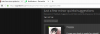
1. I don't know if someone has pointed this out (I feel like someone has pointed this out), but the social media icons are a bit screwy when they're hovered over.

2. The top bar/logo gets oddly scaled (MV-tan gets squished, the V is a bit cut off) when I scroll down the page. Not a huge thing, but like I said, I'm nitpicking. xD

3. This is gonna sound like heresy considering I designed the default background, but I think it would actually look better (read: cleaner) if we went back to a black/dark grey background as the default.
Because there's so much going on on the main page, it just kinda looks cluttered now.

I hope your body is ready for nitpick!
1. I don't know if someone has pointed this out (I feel like someone has pointed this out), but the social media icons are a bit screwy when they're hovered over.
2. The top bar/logo gets oddly scaled (MV-tan gets squished, the V is a bit cut off) when I scroll down the page. Not a huge thing, but like I said, I'm nitpicking. xD
3. This is gonna sound like heresy considering I designed the default background, but I think it would actually look better (read: cleaner) if we went back to a black/dark grey background as the default.
Because there's so much going on on the main page, it just kinda looks cluttered now.
")
")