Indie Dev

Hello Guest!. Register a free account today to become a member! Once signed in, you'll be able to participate on this site by adding your own topics and posts, sell your games, upload content, as well as connect with other members through your own private inbox!

Enhanced Maps

Jobin

Towns Guard
Xy$
0.00
Ok, so I know this is gonna be a stupid question, but I figured I'd see if anyone could help out some.

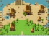
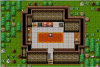
Right now my company is working on our first RPG Maker MV game and it is going to have upwards of 2000 maps. We have a good chunk done, however the maps look pretty.. simple.. I guess would be the best way to define it. We have taken the time to add a great deal of pictures and trees and such and even tried adjusting the tint but nothing seems to make them better. Below is a town, and also a shop that we have that shows what I mean by "simple". Is there anything we could be doing differently to make the maps look better?
Thanks in advance!
Screenshot (3).png
Screenshot (4).png
 
Last edited:

Eien Nanashi

Temporarily Goddamn Bright Yellow
Xy$
0.00
There are quite a few parallaxing tutorials out there, although I haven't tried them myself XD

But indeed, parallax mapping can make your maps look absolutely beautiful. It takes a lot of work/longer amount of time to do, however.
If you're going to have that many maps however (which I think is... too much, unless your game is extremely long), parallax mapping might become inefficient.

Also, may I ask why you posted the same topic in MV Discussion (with screenshots)? This is the correct sub-forum to ask about mapping, and you should only have just one thread about the same thing.

Here are my thoughts on the maps:
For the 1st map, maybe you could put something on the walls. The plants and rocks outside seem to be placed very randomly, and looks confusing. Indeed, nature is a bit random, but it does have somewhat of an order.
Usually the trees will be grouped together, and have bushes and other smaller things outside. To me, having small bushes and shrubs inside look weird, especially if you can't get into that part of the map. The placement of the rocks look quite messy, I would use less rocks or put them a bit to the side.
The ground circles around the building, and looks odd. Shift+Click mapping can fix this. (Hold Shift and press right click on a grass tile. It will copy that exact look of that tile, and will not be affected by auto-tiling. While still holding shift, left click to put it down.)

For the 2nd map, the upper half of the map looks mostly fine. The bottom half looks a bit empty, especially on the large center path, since the grass is not varied. I also think there's too much flowers on the sides, and form lines that are a bit too straight. I would like to say something about the rocks, but they might already be fine.

I'm not much of a mapper, but I hope this helps.

Parallax mapping will give you much more freedom in placing decorations, and that's always good.
I believe the only downside to parallax mapping is the extra time needed to complete them. XD
 

Jobin

Towns Guard
Xy$
0.00
I posted in the wrong forum the first time, then I saw this topic one and realized this would be the one I needed to post in. I will delete the other posting.

In regards to your advice I definitely appreciate the feedback. The game is intended to be rather long so there does have to be a good deal of maps, but it does look like parallax mapping is what we were looking for. Also, thank you for the tip of shift + right clicking I never knew that.
 
Top