Indie Dev

Hello Guest!. Register a free account today to become a member! Once signed in, you'll be able to participate on this site by adding your own topics and posts, sell your games, upload content, as well as connect with other members through your own private inbox!

Art Critique

Demonboy75

Towns Guard
This thread is to post my art and ask people to tell me what I can do to make it look better. I'm always looking to improve, so please don't be overly nice. Be as mean as you want! I'm serious, you can call it TRESH if you so choose.
For those who don't already know, this is for my work-in-progress title, "The Factory." I will give plot details later, but for now I'm looking to get all the art for the first area done.

$Showingoff5.png
The main character, C1-M2.
!Button1.png
The model for buttons. There are two so that the model can reverse and, as a result, the effects of the button will reverse.
Boxes1.png
The art for a box that will be found in the factory. Gear with small boosts and recovery items will generally go in the small boxes.

StorageA.png
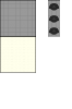
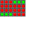
Tileset A for the first area of the game. It will be updated shortly to accommodate for the spikes only having 3 displays and not 9, like the rest of the tiles.
StorageB.png
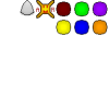
Tileset B, which consists of teleporters, all coded different colors so people know which leads to which, the model for a spike, and a logo seen often in this game that belongs to the titular Factory.

BattleScreen.png
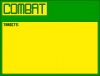
The battle screen for the game. The game focuses on being a robot, so I thought an interface that looks like it would be through a robot's eyes was fitting.
Bladebot.png
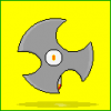
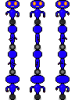
Bladebot: Main enemy in the first area.
Courierbot.png
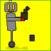
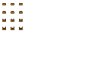
Courierbot: Uncommon enemy in the first area who will drop healing items (Chargers) for the player to use.
 
Last edited:

ejronin

Villager
Xy$
0.00
I think there's needs to be better context before anyone can critique this. By itself and without context, it looks unrefined - but that's only because all I have to compare and contrast with is the stock assets of RMMV and a few other titles I've explored.

A real critique will largely depend on whether what you've present is consistent with other assets in your title and whether the visual feel is appropriate for your game mechanic. If it doesn't then it doesn't matter - it's bad on those merits. If it does, then it doesn't matter because it fits the title.
 

Cyanide

Adventurer
Xy$
0.00
Hi Demonboy75,

First of all nice to see that you are spending time on your own graphics and style. Kindly find some comments about your images below:

I am not sure if this is the style you want to achieve (so just ignore if the critique in case it is):
  1. You seem to use only a base color and a highlight color it would give your graphics mor deept and perspective feeling if you would use more color shades like a darker midtone and shadow as overall a lot looks quite flat for me. (e.g. your buttons). The bot would need shadow too below his arms. Best would be to take a look on some light studies or tutorials you can find a lot when you google.
  2. I would also suggest to change the highlights on your courierbot more according to where your light source is. For example I think that the highlight on the top of the shoulder would be almost gone or next to a shadow as the head seems to be big what is fine for a bot :)
  3. The boxes are looking like they are from the side not from top-side view. Maybe you want to show a bit more of the top of the box? Or is this the style you want to achieve?
Good luck and looooot of inspiration!
 

Demonboy75

Towns Guard
Hi Demonboy75,

First of all nice to see that you are spending time on your own graphics and style. Kindly find some comments about your images below:

I am not sure if this is the style you want to achieve (so just ignore if the critique in case it is):
  1. You seem to use only a base color and a highlight color it would give your graphics mor deept and perspective feeling if you would use more color shades like a darker midtone and shadow as overall a lot looks quite flat for me. (e.g. your buttons). The bot would need shadow too below his arms. Best would be to take a look on some light studies or tutorials you can find a lot when you google.
  2. I would also suggest to change the highlights on your courierbot more according to where your light source is. For example I think that the highlight on the top of the shoulder would be almost gone or next to a shadow as the head seems to be big what is fine for a bot :)
  3. The boxes are looking like they are from the side not from top-side view. Maybe you want to show a bit more of the top of the box? Or is this the style you want to achieve?
Good luck and looooot of inspiration!
Thanks for the input! I made a few minor adjustments to everything based on what you told me, and I really like the way it looks. I hope you concur, and I plan to take into account these sorts of lighting and perspective issues I encountered with future models. Once again, thanks for the input, it really helps to make the game look better :)
 

Status Gear Entertainment

Praised Adventurer
Starting off fresh I see. It's how I learned a long time ago. A good tip to remember, even if you are keeping things basic, your "COMBAT" and "TARGETS" are completely surrounded in their own black box. Just as you did with the Yellow portions, add some space between your combat and targets words. This in the art and coding world is what we call "Padding". For some reason it's just more comforting to see your designs spaced out rather than having them clump together, it gives the audience this compressed feeling. I attached the example done in Paint XP. Remember, it's the little things that count sometimes. (glad)
 

Attachments

Demonboy75

Towns Guard
Starting off fresh I see. It's how I learned a long time ago. A good tip to remember, even if you are keeping things basic, your "COMBAT" and "TARGETS" are completely surrounded in their own black box. Just as you did with the Yellow portions, add some space between your combat and targets words. This in the art and coding world is what we call "Padding". For some reason it's just more comforting to see your designs spaced out rather than having them clump together, it gives the audience this compressed feeling. I attached the example done in Paint XP. Remember, it's the little things that count sometimes. (glad)
Thank you. I thought about changing the battle screen a bit, and I'll be sure to credit you when I finish the game for not only the edit, but also the advice. It did feel a bit claustrophobic, now that I look at it more, and I think this new edit makes things feel a lot more professional and polished.
 
Top