
@HotfireLegend From looking at my post about the sidebar I noticed what's wrong. The sidebar pic was enlarged, but it is still using the pics from before, simply scaled up from 48x48px to about 80x80px.
Indie Dev
Opinions, Bugs, Changes, etc. New theme!
- Thread starter Xyphien
- Start date
HotfireLegend
Balthier
- Xy$
- 0.00
Yeah, I did some investigation - it's upscaling from the "natural size". I still don't recall it being blurry before. Does anyone else?@HotfireLegend From looking at my post about the sidebar I noticed what's wrong. The sidebar pic was enlarged, but it is still using the pics from before, simply scaled up from 48x48px to about 80x80px.
I never noticed it being blurry until LTN brought it up. I don't recall if it was blurry before that or not.Yeah, I did some investigation - it's upscaling from the "natural size". I still don't recall it being blurry before. Does anyone else?
Bizarre Monkey
I SHALL BE GLORIOUS!
- Xy$
- -0.10
I'm having a lot of trouble using this site suddenly, started yesterday, really slow to load everything, sometimes ending in a white page, I can't even access my PM's as i keep getting whited-out.
This is the only site this occurs with, and I frequent another site that uses Xenforo and it's been fine.
This is the only site this occurs with, and I frequent another site that uses Xenforo and it's been fine.
HotfireLegend
Balthier
- Xy$
- 0.00
Clear browser cache and cookies for this site, then test again.I'm having a lot of trouble using this site suddenly, started yesterday, really slow to load everything, sometimes ending in a white page, I can't even access my PM's as i keep getting whited-out.
This is the only site this occurs with, and I frequent another site that uses Xenforo and it's been fine.
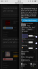
I've found another bug lol So when the top nav bar is static and positioned at the top of the page the themes logo is not there, which I'm assuming is how it should be, but as soon as I start scrolling down and the top nav bar follows along it switches and the logo appears.
Positioned at the top the logo is not visible.

After scrolling down a bit, the logo becomes visible.
After scrolling down a bit, the logo becomes visible.
I have fixed this :DI've found another bug lol So when the top nav bar is static and positioned at the top of the page the themes logo is not there, which I'm assuming is how it should be, but as soon as I start scrolling down and the top nav bar follows along it switches and the logo appears.
Positioned at the top the logo is not visible.
View attachment 2253
After scrolling down a bit, the logo becomes visible.
View attachment 2254
Sooo I noticed there are two options in the dark theme which are not here in the game zone theme. What I'm talking about are these lil icons options for the replies. Some new seem to be added to the dark theme but they don't appear in the game zone theme. The "icons" aren't easy to see, since some of them still have no icons (but the tool is already there, idk it's hard to explain?) and there's no visible border of the icons, in the dark themes they were in these squares and in game zone i click randomly on the grey and it makes the tags for comment or wiki. And there also seem to be a few issues with the wiki embed anything link thing. I'll just post the pics here i guess XD
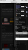
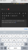
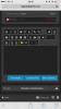
Edit: some of them might also be BC I'm using the mobile version. The third and fourth pictures are there for comparison, the game zone one doesn't have these "borders" for the icons, hope it's more clear now what I've tried to say?
Edit: some of them might also be BC I'm using the mobile version. The third and fourth pictures are there for comparison, the game zone one doesn't have these "borders" for the icons, hope it's more clear now what I've tried to say?
- Xy$
- -2.45
Friendly reminder, unless we are waiting for viable update upload, that Game Zone theme Support/Partner tab is not on top. :)
[doublepost=1455211360,1455133149][/doublepost]I LOVE it when the page is fully loaded (can get take a little time with throttled satellite internet), that the HEADER tabs are available, without having to scroll up. Thanks a bunch, this is very convenient and useful.
[doublepost=1455211360,1455133149][/doublepost]I LOVE it when the page is fully loaded (can get take a little time with throttled satellite internet), that the HEADER tabs are available, without having to scroll up. Thanks a bunch, this is very convenient and useful.
Support/Partner tab is now on the top :DFriendly reminder, unless we are waiting for viable update upload, that Game Zone theme Support/Partner tab is not on top. :)
[doublepost=1455211360,1455133149][/doublepost]I LOVE it when the page is fully loaded (can get take a little time with throttled satellite internet), that the HEADER tabs are available, without having to scroll up. Thanks a bunch, this is very convenient and useful.
Also, I'm glad you like the header tabs :D I found it to be a good feature!
- Xy$
- -2.45
http://rpgmakermv.co/threads/forum-information.622/page-2#post-22092I miss my Dark theme....... T_T
It was said here that the dark theme was going to be removed. Sorry @Akod I can't quote your post rn since I'm on my phone and it just doesn't work (?)
I like the new premium site, it looks way more prettier and you can see each opportunity for the different memberships. Even though it looks weird if you get all of the se things for partner and or sponsor but that's also good since they're get treated equally. But did partner just become more expensive ...?
Ah, I didn't read that part of the post, I only read about HFL joining the staff. I'm like @Macro, I miss my old theme. =(http://rpgmakermv.co/threads/forum-information.622/page-2#post-22092
It was said here that the dark theme was going to be removed.
I noticed it about a week ago, so it's been at least a little while.But did partner just become more expensive ...?
Me too bro. I really dislike this font. :cI miss my Dark theme....... T_T
Well Xiffy, I hope you don't mind if I make a list of complaints/suggestions in the future...! :D
#1 is definitely the font though, I miss the one from the old dark theme. I'll make a list when I feel awake...give me a few days!
EDIT: will you be adding a way to minimize the side panels? (staff online, members online, etc) I'd love to see this in the future
Last edited:
I don't see the problem with the font. What exactly is wrong with it?Me too bro. I really dislike this font. :c
Well Xiffy, I hope you don't mind if I make a list of complaints/suggestions in the future...! :D
#1 is definitely the font though, I miss the one from the old dark theme. I'll make a list when I feel awake...give me a few days!
EDIT: will you be adding a way to minimize the side panels? (staff online, members online, etc) I'd love to see this in the future
Yeah, I need to go through, and see what code I forgot to add to get this to work, or if the theme itself is causing it to malfunction. I'm 90% sure it's the code though.