Indie Dev

Hello Guest!. Register a free account today to become a member! Once signed in, you'll be able to participate on this site by adding your own topics and posts, sell your games, upload content, as well as connect with other members through your own private inbox!

Title Screen Help?

Arythorn

Towns Guard
Xy$
0.00
We all know the first thing people see when they pick up a game is the Title - It's important, and so is its font and presentation... which just so happens to be the thing I am finding, well, rather problematic.

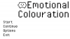
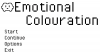
The current game title I have is this
Text 1.PNG

The problem is... It reminds me too much of Undertale in basically every aspect due to the font and the colours. The problem is, I'm unsure what font to use to still keep the style I want (My game's art style is very simplistic yet still kind of pixel-y/chunky) without losing the feel of the game (Very gentle yet deep)

Now the coloured orbs play a vital role in the game, they represent a key element - again, kind of like Undertale, though I'm only really realizing this now...

So if anyone could help me with layout or stylizing or anything before I go any further, it is much appreciated!
 

Arythorn

Towns Guard
Xy$
0.00
Thing is, I'm not even sure whether a pixel font would best suit the game. Perhaps more, 'chubby' fonts could work better (if there is such a thing) as in fonts that are smoother and bold? I'm also unsure whether an all caps font almost could make the game seem childish??
 

Amysaurus

Digital Artist
Staff member
Resource Team
Ahhhh, okay. I don't know much about how your project looks, so it's hard to know what would work lol! (cheeky)

I can't really find any puffy pixel fonts that aren't all caps, so here are just some puffy/bold fonts:
Chewy - Endutt - Sniglet

Are any of these closer to what you're looking for? (I'm like obsessed with fonts, so I don't mind digging through them, lol!)
 

Arythorn

Towns Guard
Xy$
0.00
@CraftGeek Ooh, I do quite like that! Interesting thing is, the email notification I received had a longer post than this aha, I'm guessing it was edited.

EDIT - After trying out the suggested font (and frankly, loving it!) I have re-worked my title screen layout but now face the problem of large white space that, ideally, needs something in it.

Text 2.PNG

Managed to fill in a small bit of space and make the title nicer by putting in the main character, but I'm stuck as to what to do with the rest (mainly the large portion under the title)
 
Last edited:

Arythorn

Towns Guard
Xy$
0.00
That's what I was thinking. But all my characters look the same only with slight variations and different colours. The coloured 'orbs' in version one plated a big role. I explained this to Amy in a conversation and here is what I said.

The game is set around one base character, trying to learn about emotions because s/he doesn't really understand them. The coloured orbs on the title screen represent the different emotions - Anger, Happy, Jealous, Sad and Frightened. The title screen will play a rather important role, as each colour only shows up once the corresponding emotion is learned about... which is why I need them on the title screen. Also unlocking said emotions improves the title music, just for fun and so I get to record more music aha.

So by the end of the game, the title would have a lot more colour, perhaps by using the new character sprite's on the title. But it's how it looks at the START that needs working on (colour would indeed help like you said... it's just how it's integrated.)
 

CraftGeek

Knight
Xy$
0.01
Great concept, I'm not sure how to integrate it at the start. It looks great though. I like the little character, I would probably offset the word "Emotional" to break up the space (that's just my opinion, I still think it looks great the way it is as well>)
 

Attachments

Arythorn

Towns Guard
Xy$
0.00
That's what I was thinking, although maybe I should the character to the other corner so it balances the image because obviously with the start menu on that side it could feel a little too crowded. Perhaps if I just used an image to fill the space at the bottom, maybe another important part of the game such as a certain place or something? (I have an image in mind, I'll just have to do it later because it's nearly 1AM over here in the UK :P)
 

Arythorn

Towns Guard
Xy$
0.00
Phew, OK. Here is what I managed to conjure up. The leaves in the background have a slight tint in attempt to bring colour to the image yet retain the monochromatic feel.

Emotional Colouration Title Screen V3.jpgHmm... the I guess currently, tree looks both out of place and lonely... but I'm still thinking how to rectify that one... maybe it would look alright though, I'm a little unsure.
 

CraftGeek

Knight
Xy$
0.01
I like that, it looks really good. I don't see anything wrong with the tree. If you're going to add things as they're unlocked, then it won't be lonely for long.
 

Arythorn

Towns Guard
Xy$
0.00
Of course, now I just have to find a way to incorporate the colours in (I was thinking maybe adding leaves to the tree or perhaps fruits to represent them?)
 
Top