Indie Dev

Hello Guest!. Register a free account today to become a member! Once signed in, you'll be able to participate on this site by adding your own topics and posts, sell your games, upload content, as well as connect with other members through your own private inbox!

Thoughts/Critiques for my First City

LoreMaster

Villager
Xy$
0.00
I'm somewhat happy with how my first large city map turned out, but I could use some fresh eyes and opinions, particularly on a few things...
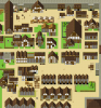
This is Lower Drumwell, the less affluent of two regions in the overall city. I intentionally made most buildings small and compact as I was going for a "Medieval Londonesque" feel. This led to some mapping decisions I'm unsure of.
The main points of interest are the corner market, a small pub, an inn, a chapel, a mansion belonging to a crime boss, and a warehouse/workshop off the main road (the building with three openings, surrounded by crates).
I wanted to encourage exploration and intend to fill this with amusing NPC interactions, background lore, and side-quests.
* Note: I've not added all the embellishments yet, but I wanted opinions before proceeding.
My main concerns: Is it interesting enough to warrant exploring? Is the layout too cluttered or confusing? Is the map size appropriate for half of a capital city. Any other opinions or critiques are appreciated as well.
 

Attachments

Lore

Resident Dragon
From what I'm seeing, it looks to be coming along nicely.

The size of the city in question is all dependant on your game. For instance, my game has 10 major cities, but they range in size, with the largest going to be covering about 4 - 6 maps.

In terms of the layout, I feel that it seems a little crowded, but being a dense city, that is to be expected. What I would recommend is using a different tile for major thoroughfares, like cobblestone. Edging on some of the roads would help too, as this is an artificial construction, and let's face it, most city dwellers like their pathways edged. Don't be afraid to leave some of the sand tile there, though, to make it look like worn patches in the road surface.

Some of the buildings you've named as major points (specifically the pub, chapel and mansion) should stand out to the player so that they can definitively identify them. It might be something as simple as a sign out the front, but you could also have signs directing the player towards the areas they are located in.

Otherwise, it's looking good! :D
 

LoreMaster

Villager
Xy$
0.00
Thanks for the input! My game is meant to be dense in content, once it's done, but not covering a massive landmass, like some I've seen on here. I'll only have about three "large cities" and a few more smaller towns. I'd say you definitely have a point about the roads, too. I'll see what I can do!
 

Phil

Adventurer
Xy$
0.00
It have some redeeming quality into it, however, placements of buildings are way too bland and organized
preventing it to be more interesting. The ground is very flat, making it looks dull and completely predictable
and uninteresting, also it will be better if you don't use the basic RTP because they are too common in projects,
I am not saying that that the RTP are bad, they are good if they are used right, I am saying that if you want your
map to flesh out, you can use custom tilesets. I also reccomend trying our Parallax mapping, it will make your
map more interesting and fleshed out, There is a video on it by Fallen Lorelei.

In Conclusion:
Your map is good for a first time, however there are negative aspect of the map that are pulling it down.

Don't give up, keep improving, and with some time, you will be a fantastic mapper.
Good Luck :)
 

LoreMaster

Villager
Xy$
0.00
Thank you for the input, and I see some of these points. However, you mention the layout as overly organized. I'm not quite clear on how that is an issue... That was actually kind of what I was going for. Aren't many real-life cities planned out like this? Maybe you could explain why organized is bad in a city map, since I'm not understanding. And Thanks for the video! Editing in Gimp could definitely smooth out some rough edges.
Anyway, having taken some advice from @Lore , I added cobblestone to the more central roads on the map, and increased the chapel to a more prominent size, though I don't want it too grand, as this is a poorer region of the city... I also expanded the city wall to give a clearer sense of structure. Better? Worse? Thoughts?
 

Attachments

Last edited:

Phil

Adventurer
Xy$
0.00
Thank you for the input, and I see some of these points. However, you mention the layout as overly organized. I'm not quite clear on how that is an issue... That was actually kind of what I was going for. Aren't many real-life cities planned out like this? Maybe you could explain why organized is bad in a city map, since I'm not understanding. And Thanks for the video! Editing in Gimp could definitely smooth out some rough edges.
Anyway, having taken some advice from @Lore , I added cobblestone to the more central roads on the map, and increased the chapel to a more prominent size, though I don't want it too grand, as this is a poorer region of the city... I also expanded the city wall to give a clearer sense of structure. Better? Worse? Thoughts?
Alot better, the gravel give sense of direction.
 

LoreMaster

Villager
Xy$
0.00
One thing I'd like to note for anybody viewing, is that this poorer community is meant to have a "depressed, resigned" feel to it. Not super dark, but drab; colorless if you will. Part of the game's story is a centuries-old war that's wearing away at the lower classes, while the nobility celebrate the slaughter. A pickpocket (the player) is brought into the Royal household by a twist of fate, and begins to sway a prince to seek a resolution against his elder brother, the heir to the throne's will.
 

Lore

Resident Dragon
I'm liking the story extract, and I'm liking what you've done with the roads. Makes it look a little more city-like.

Just remember though, even though the poorer community would be worn down by the war, they would do what they could to make their lives as pleasant as possible. Maybe sneak in a community garden where the older generations meet to pick herbs for their limited food to give it a bit more flavour? (as an example)
 

Phil

Adventurer
Xy$
0.00
One thing I'd like to note for anybody viewing, is that this poorer community is meant to have a "depressed, resigned" feel to it. Not super dark, but drab; colorless if you will. Part of the game's story is a centuries-old war that's wearing away at the lower classes, while the nobility celebrate the slaughter. A pickpocket (the player) is brought into the Royal household by a twist of fate, and begins to sway a prince to seek a resolution against his elder brother, the heir to the throne's will.
If a darker tone and feeling is what you're looking for, I think this is far too colorful and perfected.
If you look in the tilesets, there are cracks in the tileset, this will help achieve a more, broken
imperfect feel to the map. I also recommend using darker color because this will provoke feeling of uneasiness
and discomfort.

I made tileset for darker medieval here:
https://rpgmakermv.co/resources/medieval-tileset.982/

Starbird made trees and monuments
https://rpgmakermv.co/resources/trees-and-more-monuments.952/

Cyanide made nature based tilesets which can enchance the surrounding
https://rpgmakermv.co/resources/cyanides-mv-rtp-nature_11.722/

There are more tilesets that can be used to enchance the map, in the end what you want in your map
is to convey the emotion in your game, and you need to convey it not only through text, but through
visual and colour.
 

LoreMaster

Villager
Xy$
0.00
@Lore : That's an excellent idea, about the herb garden, and it enchances the storytelling. A great example of "showing" rather than " telling." :)

And, @Akamizu, I didn't want it to be dark, just "somber" or "resigned". I actually did use the cracks you mentioned quite extensively, in certain areas of the map, but I guess the pic was too big for them to show up clearly... And as for the tilesets, I like those nature tiles (thanks for the helpful suggestion), but the others were a bit too stylistically dissimilar to what I'm aiming for. I'll keep at it, though. Heading to bed for now.
 
Top